In this fourth Xenioo tutorial we are going to explore some advanced content actions. While in the previous tutorial lesson we displayed multimedia content rather plainly, in this lesson we’re going to use our media resources in a more dynamic way.
You can follow our lesson directly from the video below. At the end of the post you will find a Xenioo bot file that simply restores the example bot into your account for playback and testing. Let’s start!
Button Cards
The first component we will be checking out is the Button Card Action.
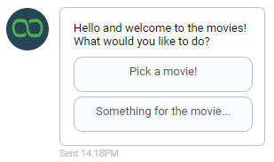
This action will display a variable amount of text (it will be split into multiple lines if necessary), as well as multiple buttons all grouped in a single frame.
We’ve already seen Quick Action Buttons but these buttons are different in two ways: first, they’re going to appear attached to the text content and second, they can be more than just a Postback to the bot.
You can, in fact, have Url buttons, that will redirect the user to another website, Phone buttons, that will activate a phone call or Share buttons that will activate the sharing of the content.
Much like we’ve seen in our previous lessons, Xenioo utilizes a component approach: the Button Card action contains only the basic properties and all the required content can be attached by adding more operations.
Go ahead and add more buttons to your Buttons Card.
Notice how the list of available operations changes? Xenioo will always filter your available actions and operations based on the most suitable, that way, you always have the content you need readily available without confusion.

Carousel
A carousel is an horizontal list of cards that can be shuffled to display different content. Ideally, each cart contains a different item that the user can browse from left and right.
Each card of the carousel can contain an image that will take most of the space, a title, a description and up to three different buttons.
As you will see in the video, with Xenioo you can build the carousel card by incrementally adding multiple components to create the exact final result you want.
To simplify things, remember that you can expand and collapse each action and sub-operation by just clicking on each corresponding icon in the properties panel.
Items List
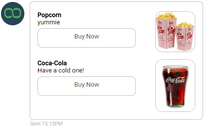
Lists are another multiple content display mechanism.
Instead of displaying images and buttons shifting from right to left, an Items List Action will display all items in an ordered table with smaller images and buttons. While the carousel may be ideal for bigger, image related content, the list is surely more suitable for a products list or a basket recap.

There’s no real limit to the number of items that can go in a list but keep in mind that the user may have limited vertical space in the chat area.
Choosing your buttons
While Postback and Url buttons are supported on all channels and platforms, Phone and Share buttons are not.
A Phone button used on a desktop browser chatbot may activate a Skype call or some kind of messaging client but it is most likely to be blocked, ruining the user experience
Conversely, a Share button is only supported by Facebook messenger, and will not be visible when using the same chatbot through browser or Slack.
Be mindful of these limitations when designing your card’s content with
Wrapping up
Knowing what type of content container is available for your chatbot is key to a meaningful information display.
In this lesson, we’ve learned how you can display content in advanced and dynamic ways.
As with all our lessons, you can find the chatbot sample in your Xenioo account so that you can import it to further experiment and learn.
